Wednesday 11 May 2011

For the advertising project we narrowed the sweets down into three final choices in which we would decide to go with which were: 1) Rolo
2)JawBreakers
3) Nerdz
After carefull consideration the group decided onRolo's. We were trying to think of witty ideas in which to help sell the rolo or give it a rebirth as they have not really been advertised for several years.

Previous Advertisements
The first thing i wanted to look at was what they have done in the past e.g Rolo advertisments used to always be about love and about who you would give your last rolo to.
the two advertisments below are previous rolo designs. The first one is more about love and how the boy wants to give his last rolo to the little girl. The other one is about a boy who wont give the rolo to the elephant and eats it himself.

After seeing these two adverts we started thinking about what our theme could be. we thought that maybe we could elaborate on the elephant one and have the elephant get its own back on the boy. I think what we most wanted was to have some sort of funny element within the advert in which to make it memorable.

Thats How We Roll
We decided that because we wanted something funny that we should try and have a pun on the words and so we came up with the phrase thats how we roll - which is all to do with hip hop culture and bling.
After comming up with this i went away and designed some rolo characters based on this idea but instead of them being just humans i wanted to incorporate the actual sweet into the design and so i came up with two chracters that are rolos ( as seen in sketchbook). Although i quite liked my idea it wasnt really what we were looking for and so another member of the group came up with a rap about rolos and we decided that its different and funny and quite relevent to the product so we went along with that idea.

TEST
We didnt no down which route we would take so i designed a storyboard around the raps words. The story board was a lot longer but we decided to change it so that it was simpler and more easy to see what was going on in the scene.
This was the animatic


We liked this due to it being comical and that it will advertise the product well. We next decided to experiment with different techniques that we could use to animate.

Research
we all decided that we didnt want it to be just a boring 2d animation where its all drawn out perfect we wanted to do something different and so we decided to look into cut out animation.I have never done cut out animation before so i decided to research it before i began experimenting. I found out it is the process of either cutting out peices of paper and moving them step by step or using photographs in a similar way. an example of cut out animation is south park\
.
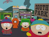
this is a very simple but effective way of using animation and we felt it could be the route to go down for our own project.

Test
I decided that i waned to experiment with this process and so i tried it out on a very short peice of the rap.


Although it is very short it made me understand how cut out animation works it also made me realise how time consuming it is and so we again began to think if cut out was in fact the right way to go.

It worked ok but if i decided to go with this idea i would need way more practice.

PIXELATION
We decided that after the cut out idea didnt work too well that we should try pixalation. i have had experience in this form of animation before so i thought this was quite a good idea. We got someone in our group to take photos of a persons face saying the rap and then we made them acut out the rap themselves so that we had a body to work from.

because he is going to be a rapper we looked at different tracksuits in which we could base our own design on here are some examples


The final Tracksuit
we decided that we wanted it to be a different colour to the rolo packaging but also we still wanted it to be linked so thought it would be quite interesting to put an R for rolo on the rappers suit.

LADIES


Monday 6 December 2010


FANTASIA


JOYRIDE


SCREENPLAY
these are some images that i looked at to help me with the screenplay project.


Monday 4 October 2010

Monday 12 July 2010

Critical Studies Retrieval


Wallace and Gromit


Wallace and Gromit were created by Nick Park and are animated at Ardman studios. I have chosen this shorts of Wallace and Gromit because it was really one of the first ardman productions to last for about 15mins. Although they had much success with creature comforts they were not that long and so Wallace and Gromit was a big step forward within the stop motion industry.
I think one thing which works well in Nick Park work is that fact that they find people to do the voices and model the characters around the voices i think this works because they have quite comical characters and the voices just go with them.
One character that works really well is gromit because he doesn't even talk and they have animated him in such a way that he is still comical and sarcastic without even moving his lips its all in his eyes.I really like this idea of having a silent character because i think its more powerful to use characters that cant speak because then it really shows that you are able to animate a characters emotions by just using there eyes.
I think this is still classed as traditional stop motion due to them using Plasticine. Nick Park likes the fact that it should be seen as it is -hand made and so all the imperfections should be shown within the plasticine. Although i don't like this aspect within stop motion i prefer the slick smooth look of perfection i fell in the Wallace and gromit features it works well because they are more focused on the characters performances and story rather than all the little things such as imperfections in the plasticine.


The Nightmare Before Christmas


This film is probably my favourite film because i really love the colour schemes in the film and just the whole story line. Again this film is stop motion but this time i have chosen a feature length film rather than the shorts of wallace and gromit.
I love the fact that this film was from the creative mind of Tim Burton and is directed by Henry Selick because with both of them working on this feature i knew that it would be weird and have an almost creepy style to it but also i love that fact that they are both perfectionists and so this film would contain the detail which animation fans would love.
I think on way in which this film shows development within stop motion is the actual scale of the project eg the size of the models and set designs which is something which draws you into the film from the start. i think that it is a good development because it meant that they could have a bigger area to work in and animate in meaning that they could show off how well they can animated characters and make them interact with the scene and other characters within the story.
One thing i love about stop motion films is that you can escape to another world and i Love the fact that in this film they have created 3 different worlds and they are all extremely different and this is shown in the colours used and the characters from each place eg the characters from Halloween town are mainly blacks, purples, reds and greens mainly associated with the Halloween theme which i think gives the atmosphere as being creepy and this is a running theme in many of Tim Burton's films and so i was glad that he kept it within his animated pieces as well.

Coraline 2009
Coraline is the latest film by Henry Selick. It is the story of a girl called Coraline Jones who moves into a house and is extremely bored until she finds a secret door which leads to another alternative world in which everything is a better version of her life until it turns dangerous and she realises this world may not be as perfect as she imagined.
Again this film is a stop motion although this one doesn't look it due to the amount of work and development which has taken place in the stop motion industry making Coraline a smooth stop motion film.
One reason this film stands out from traditional stop motion films is due to Henry Selick wanting it to have a 3d feel to it and so this makes it appear to look like its been done using CGI due to its smooth finish and its intricate detail in every scene and within in each characters design.
One thing that Henry Selick does on Coraline which isn't really used on traditional stop motion is that he doesn't use plasticine for the models he uses a special resin which is placed on top of mechanical faces making it easier and more realistic to make facial expressions. This also means that it was easier to replace the bottom facial expressions when doing lip -sync. for example on the original plasticine models they had to replace the whole head whereas in Coraline the top half of the head an the bottom half of the face are separate and so this means you can mix and match eyes with different facial expressions making it far more realistic.

Another thing i love on this film the detail which has been put into it. I think the More detailed it is the more people will watch it because its not just seen as a animation/ children's cartoon its classed a a actual film because people can relate to it. One piece of detail i love in this film is the wire hair because it just works so well and moves like actual hair something my own group tried out when doing stop motion.
Another detail which just adds to the realism of the animation is that they actually decided that they would make small outfits for each of the characters which i thought was brilliant because it makes them again appear like people with personalities. I think the amount of detail involved in this film is amazing and it is a key development within the stop motion industry and will raise the bar for future stop motion animations.
I really think that the smooth finish works well on this film because although i enjoy traditional stop motion films i don't like how imperfect they are. I feel that on some stop motion features that the little imperfections work because it shows the film as what it is- a stop motion plasticine film e.g in Wallace and Gromit you can actually see the finger prints of the animators in the plasticine but i feel that in the film coraline this would have spoilt all the detail within the film because it needed to be clean and look very finished to go with the realism in the film.
I also think that the animation within stop motion has developed and so you can now do more advanced things with animation than what they used to be able to do and i think coraline is proof of this.
I think that another thing within this film which makes it more unique than other stop motion films is that Henry Selick has decided to experiment with 3d something i think really works with 3d models drawing you into the scene/ world making you the audience involved in the film.

Peter Dodd
Peter Dodd is a animator, writer and director based in London. He has worked on films Fantastic Mr Fox, The Tale of Depereaux,The tale of Sir Richard and The Corpse Bride.
I have chosen this animator to discuss because i think that the animation in the corpse bride is so beautiful and clean cut and because he was key director/ animator on this film he did a lot of the scenes.
I think that he animated the character of the corpse bride really well because she is clumsy and her bones keep breaking but hes animated her in such a way that shes still very elegant and this works really well with her personality.
Another thing in this movie which i think works really well and the animators did a really good job of was making the characters move with the sound/ music in the background. i think this needed to work due to sound being such a huge part of animation anyway and i think that Peter Dodd and his team worked very hard on getting this aspect of the film perfect.

Monday 28 June 2010

Monday 26 April 2010

Maya

Final Domino Effect


finished room


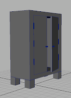
Wardrobe


Teddy Bear


Photoframes


Pen


Perfume


The Lamp


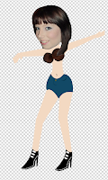
The Kimmi Doll


Glass


The Desk


The Computer


The Chair


When i out the 3d model mode on i could really see how the chair was starting to form and i really liked this chunky effect. Another reason it needed to be chunky is because i needed a teddy bear to be able to sit on top of it without it needing anything for it to lean back on and so this design was perfect for this.


This is the wire frame for my chair. i didnt want a typical chair i wanted it to be a chunky modern one with thick legs due to it looking right within my room. it is made of cubes that have been believed to make them look rounded/ comfy.

The Books
For the other books i simply duplicated the first/original one and slanted them at one another creating a bookshelf image. i feel that they worked really well to create realistic books that actually look like they have pages in them.

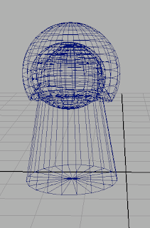
These two images show how i created the books i used cubes as the main sides and pages of the books just duplicating them to create the pages and making them slightly bigger on the sides of the books.for the spine i used a cylinder and another cylinder to create an interception/ hole in the middle in which i hoped that i could slot the pages into makeing it look like a real book.


The Bedside Table

I decided that i wanted to keep this modern effect running through out all of the items in the animation and so i realized that in most rooms people tend to have furniture of the same style within the room and so i wanted to use this in my own work.


As you can see b y leaving the draw open it makes it appear to look like someone actually lives in the room because it is messy/untidy and not perfect which i feel makes the animation more believable because if everything is perfect people will start to pick out things within the animation which dont work because they are not as perfect as the setting.
This is the wire frame for my bedside table. i used cube and cylinders within this design.An extra thing i used in this design was leaving one of the draws open and in order to do this i used the parent tool to attach/ link the handle of the draw to all of the main frame of the base so that i could move it separately in and out without trying to group every bit each time.


The Bed

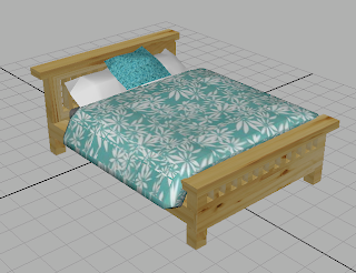
This is the final bed and i am very pleased with how it has turned out. One thing i couldn't get to work out as realistic as i wanted it to was the pillows because i couldn't get them to round as much as i wanted them to and so they still appear to look slightly square.
The textures again helped to create a atmosphere of realism within this item i decided i wanted the room to base 0n my actual room and so i took similar patterns for the duvet and used planar mapping to stretch the textures across the duvet so that it didnt look blurred and was in the same direction as the fabric.
This is the mattress, pillows and duvet for the bed. for them all i used the cube tool to create these simple shapes and then used the bevel tool and rotation tool to help me make more complicated shapes resembling the actual objects they were based on.

For my room i wanted a modern realistic look for all my furniture and so i felt that one way i could make my items look like this is by the textures that i used on them. for the main frame of the bed i used a floor board texture because it was the colour that i wanted and also it made the bed look realistic because of the knots in the wood.
This is the bed i designed on maya it is amde up of simple polygons of cubes. I decided that i wanted it to look as realistic as possible and so in order to do this i wanted to model it on an actual bed including things such as bed slacks and holes going through the head board.
I used the boleans tool in maya to intercept the little holes in the head board which took time to do but i feel was worth it in the end because it has the effect that i wanted which was for it to look as realistic as possible.